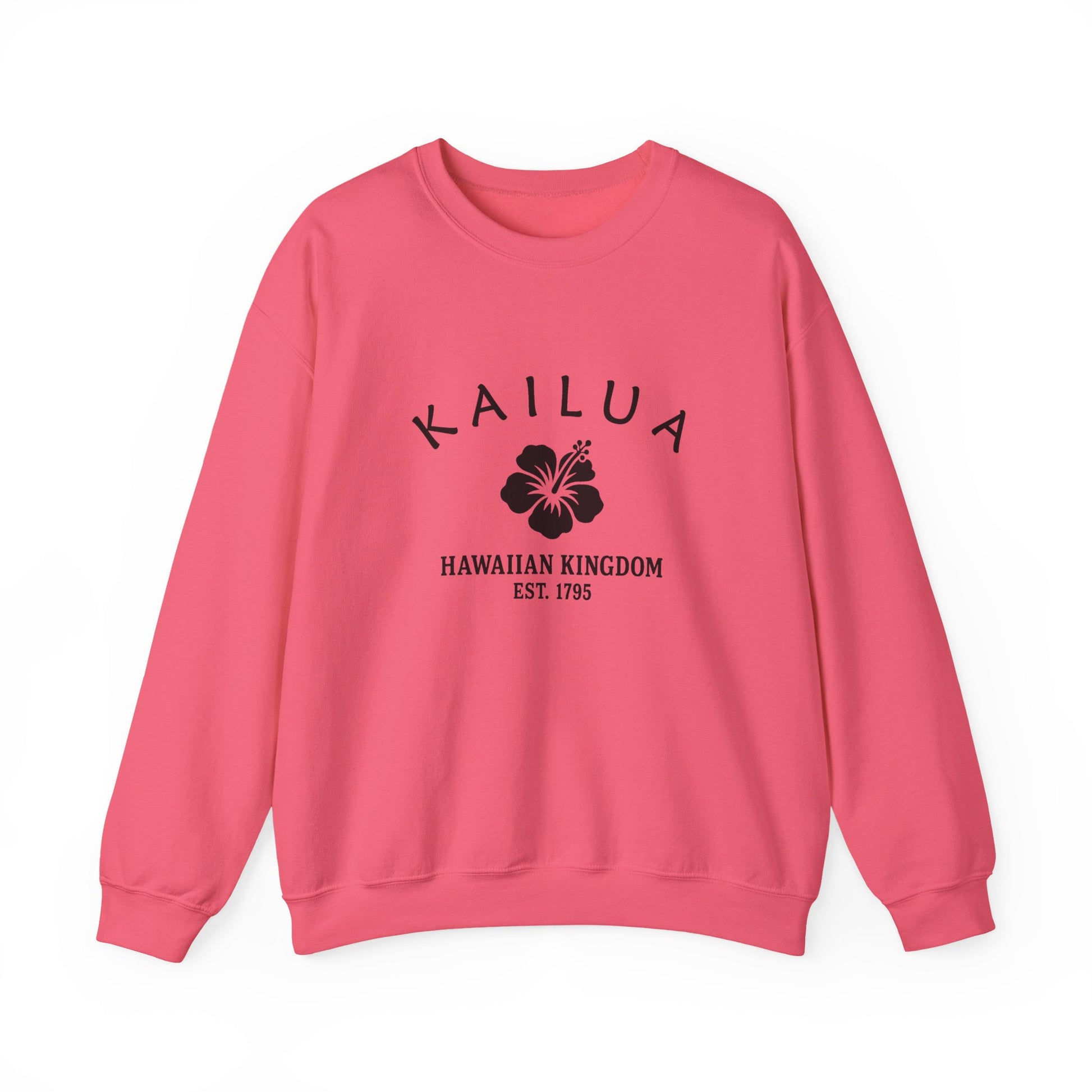

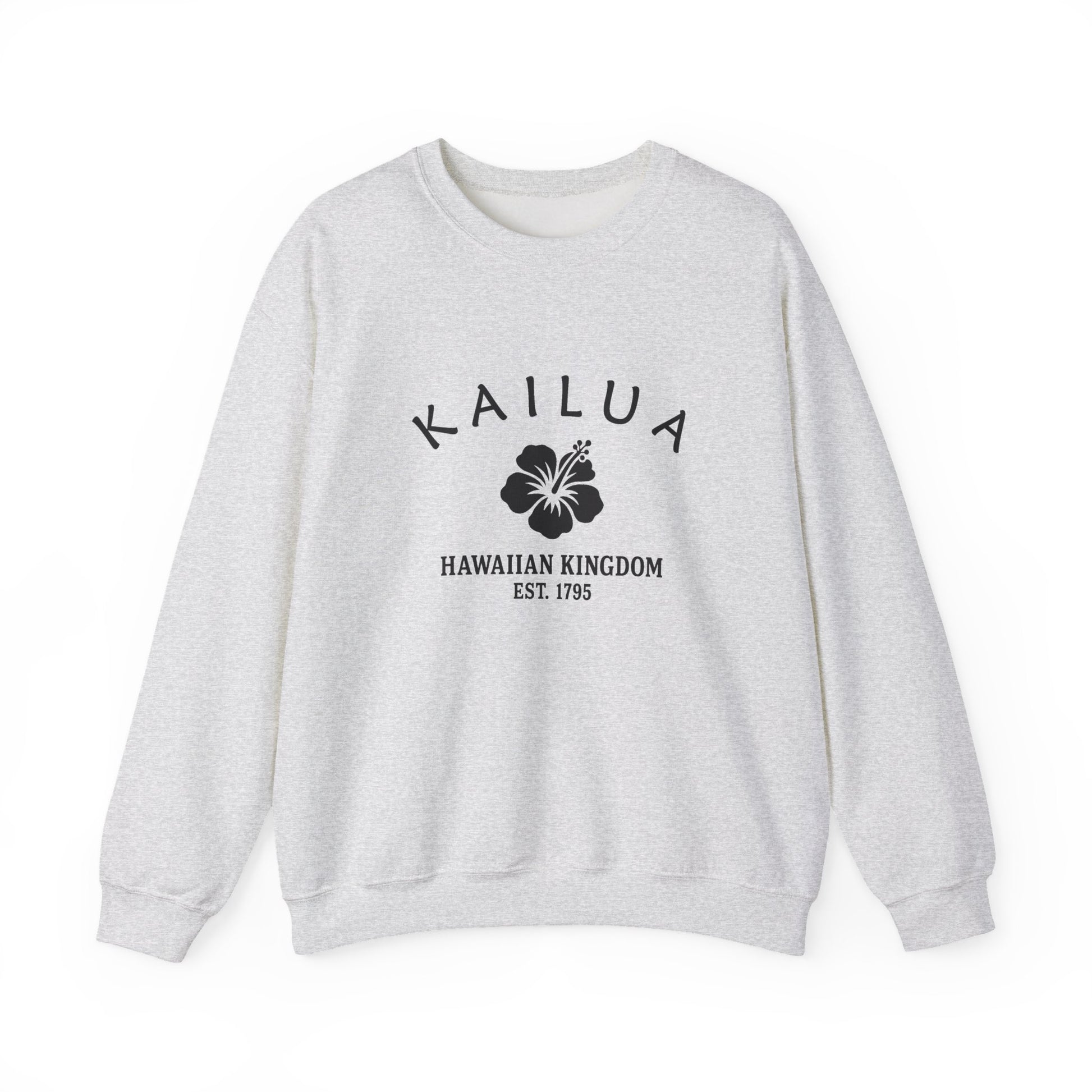
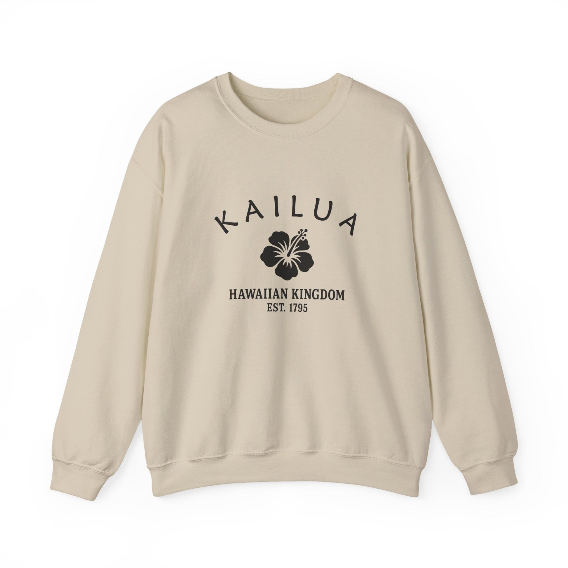
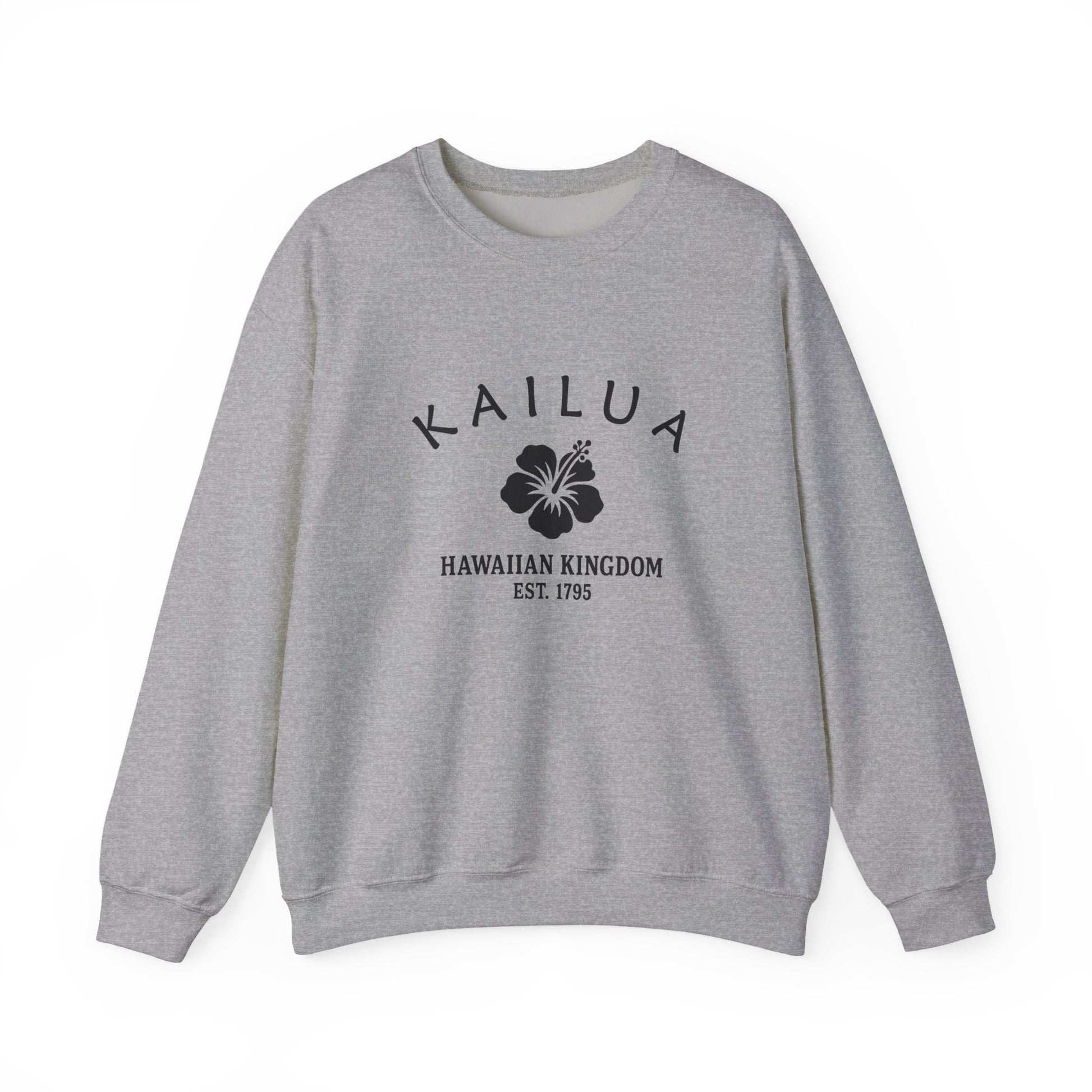

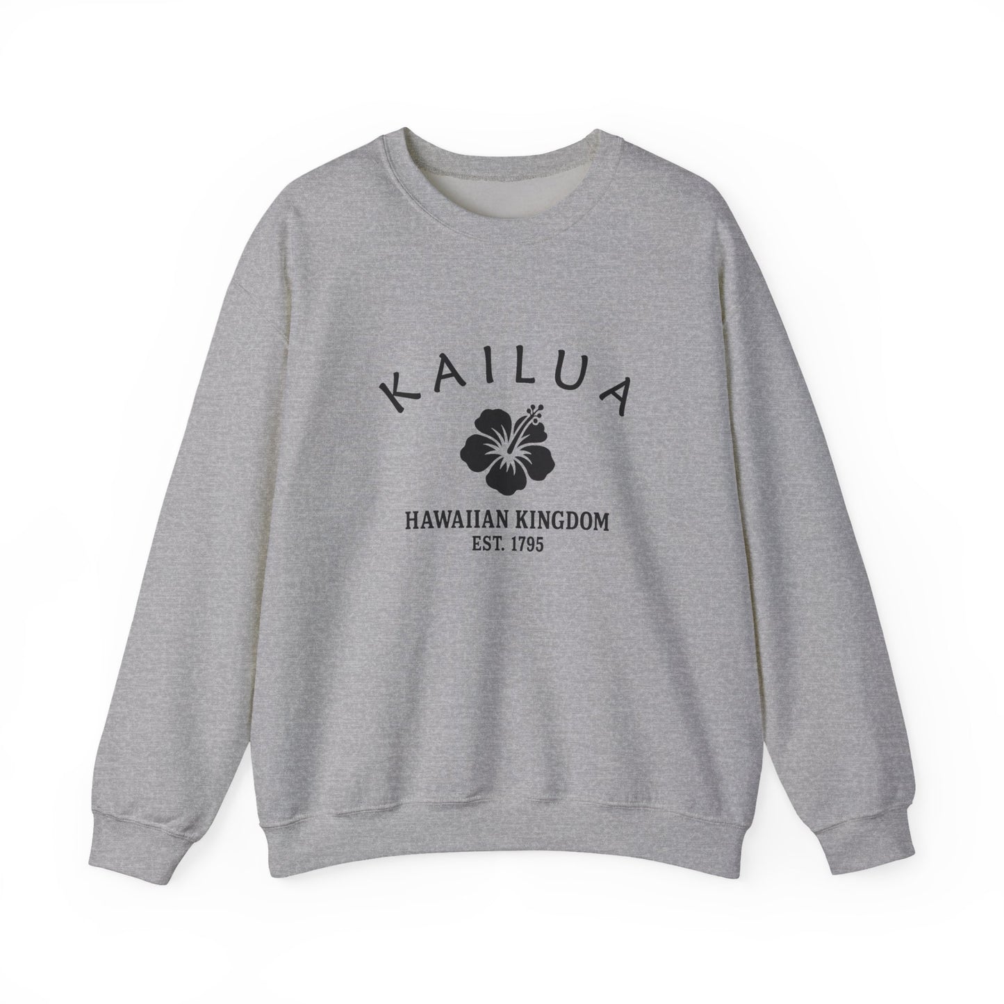

Our Kailua retro logo uses Hawaii’s hibiscus motif, symbolizing beauty, resilience, and aloha. The hibiscus reflects natural abundance and cultural identity, while “1795” connects the design to Hawaiian unification under Kamehameha. Its black-and-white style is simple and vintage, resembling travel decals or crate stamps. The motif bridges Kailua’s dual identity: a traditional community with mid-century suburban growth. On merchandise, it feels authentic and retro, not modern polish. The hibiscus motif reflects Kailua’s story of tradition, resilience, and pride, perfectly suited to a Hawaiian town balancing heritage and progress.
Kailua remained rural until the mid-twentieth century. In the 1950s and 1960s, suburban growth brought new schools, homes, and businesses, transforming it into a popular residential community. Tourism developed modestly, as visitors favored Waikiki, leaving Kailua more rooted in local life. Its beaches, however, became known worldwide for beauty, attracting surfers and travelers. This timeline reflects Hawaii’s balance: suburban expansion alongside cultural strength. Kailua’s mid-century identity blended Hawaiian tradition with cautious growth, preserving heritage while embracing modern life. Its growth demonstrated resilience and pride in community, ensuring Hawaiian culture remained central despite suburban expansion.
Why People Visit Kailua Hawaii
Kailua blends scenic beaches with Hawaiian heritage. Visitors enjoy swimming, paddling, and short hikes paired with calm town streets. It is picturesque, approachable, and meaningful to many island residents. Travelers find year round appeal in parks, paths, and public spaces. The setting combines natural beauty with accessible neighborhoods and landmarks. History and everyday culture sit side by side in a welcoming way.
![]()