
Kailua, on Oahu’s windward coast, has roots stretching back centuries. Native Hawaiians built fishponds, farmed taro, and thrived on the fertile valley. Its name means “two seas,” describing currents meeting offshore. In the nineteenth century, missionaries and planters established churches and farms, but Indigenous practices endured. Kailua’s founding identity reflects natural abundance and cultural resilience, a community shaped by both land and sea. While development later reached its shores, Kailua remained tied to its Hawaiian traditions, balancing new influences with the aloha spirit and enduring strength of its Indigenous heritage.
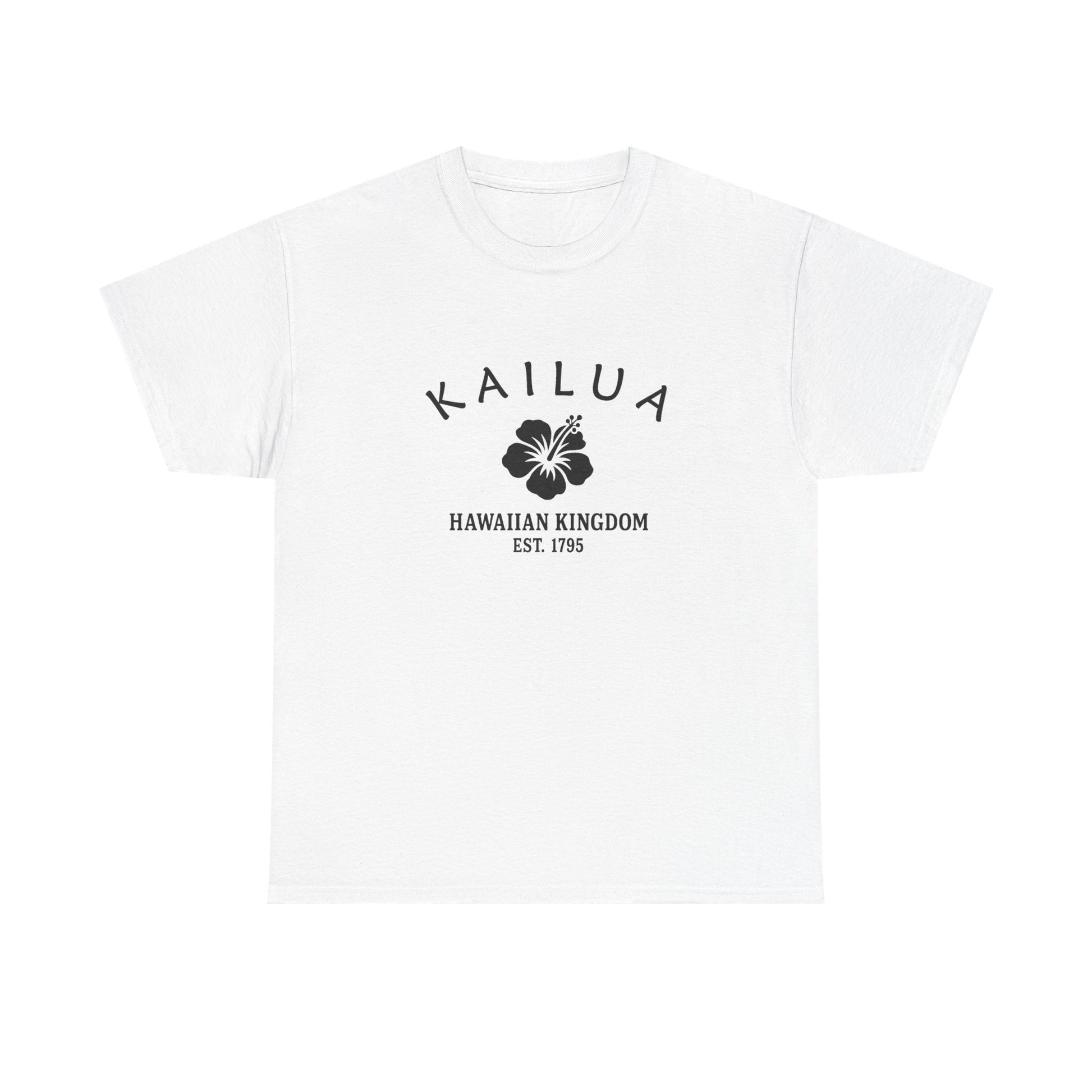
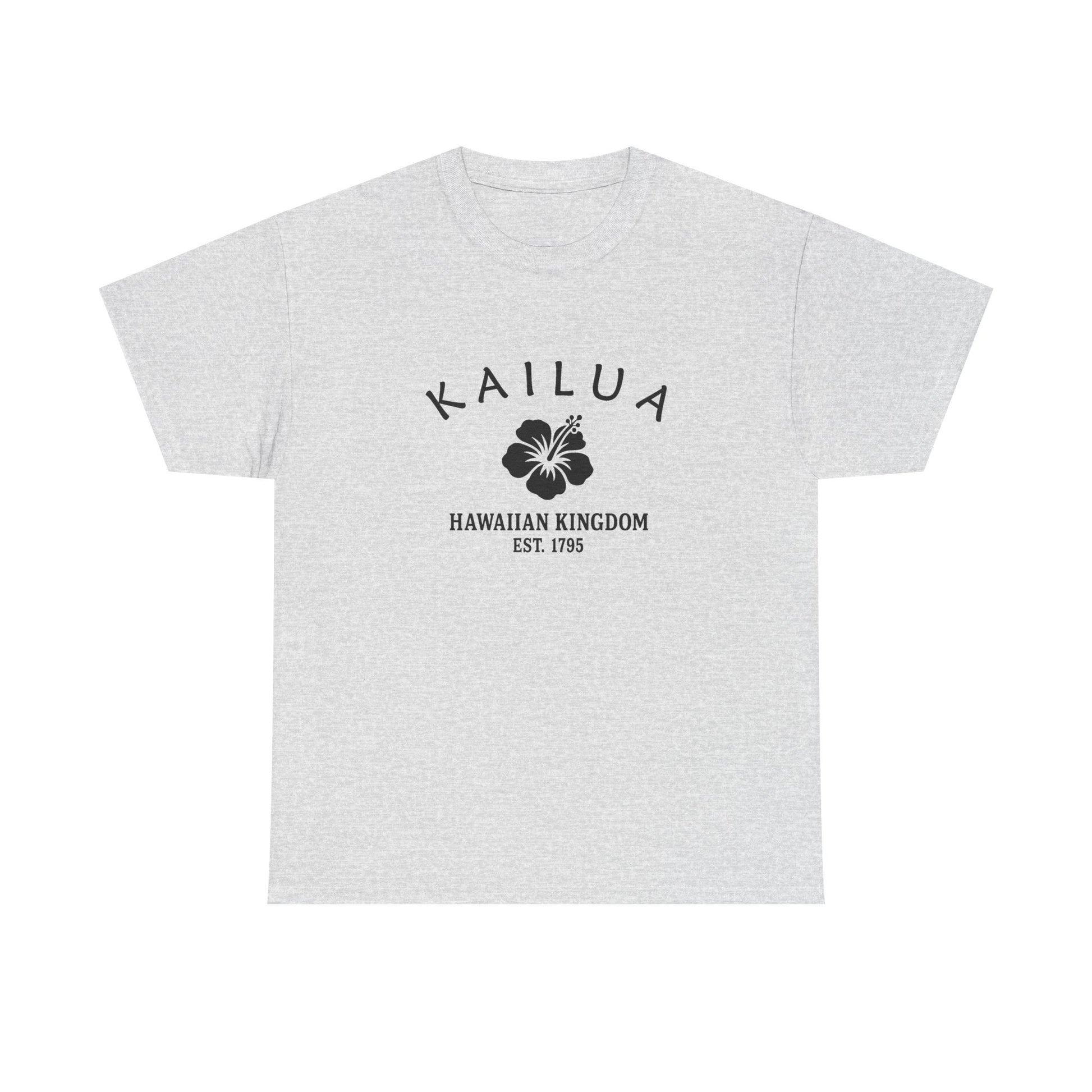
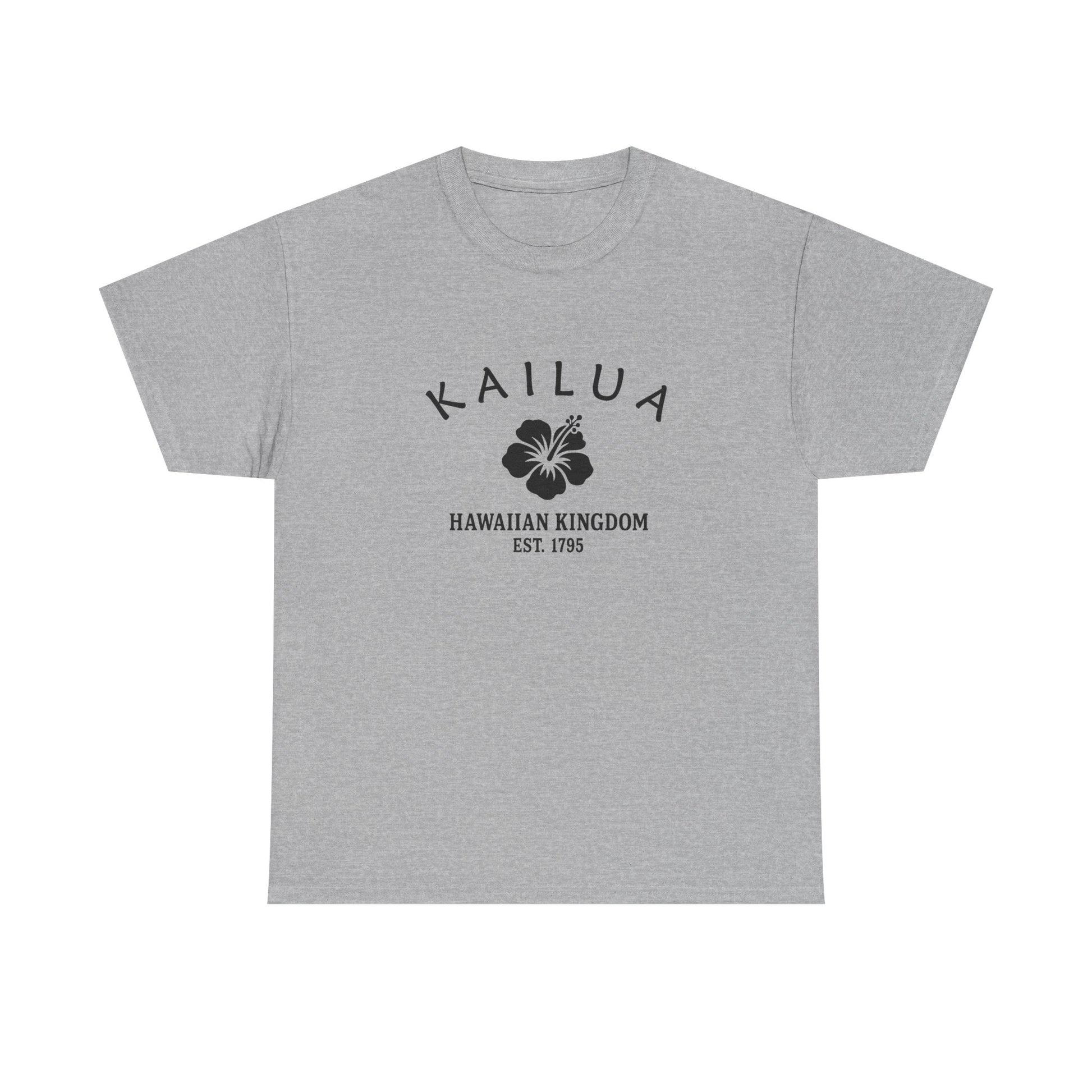
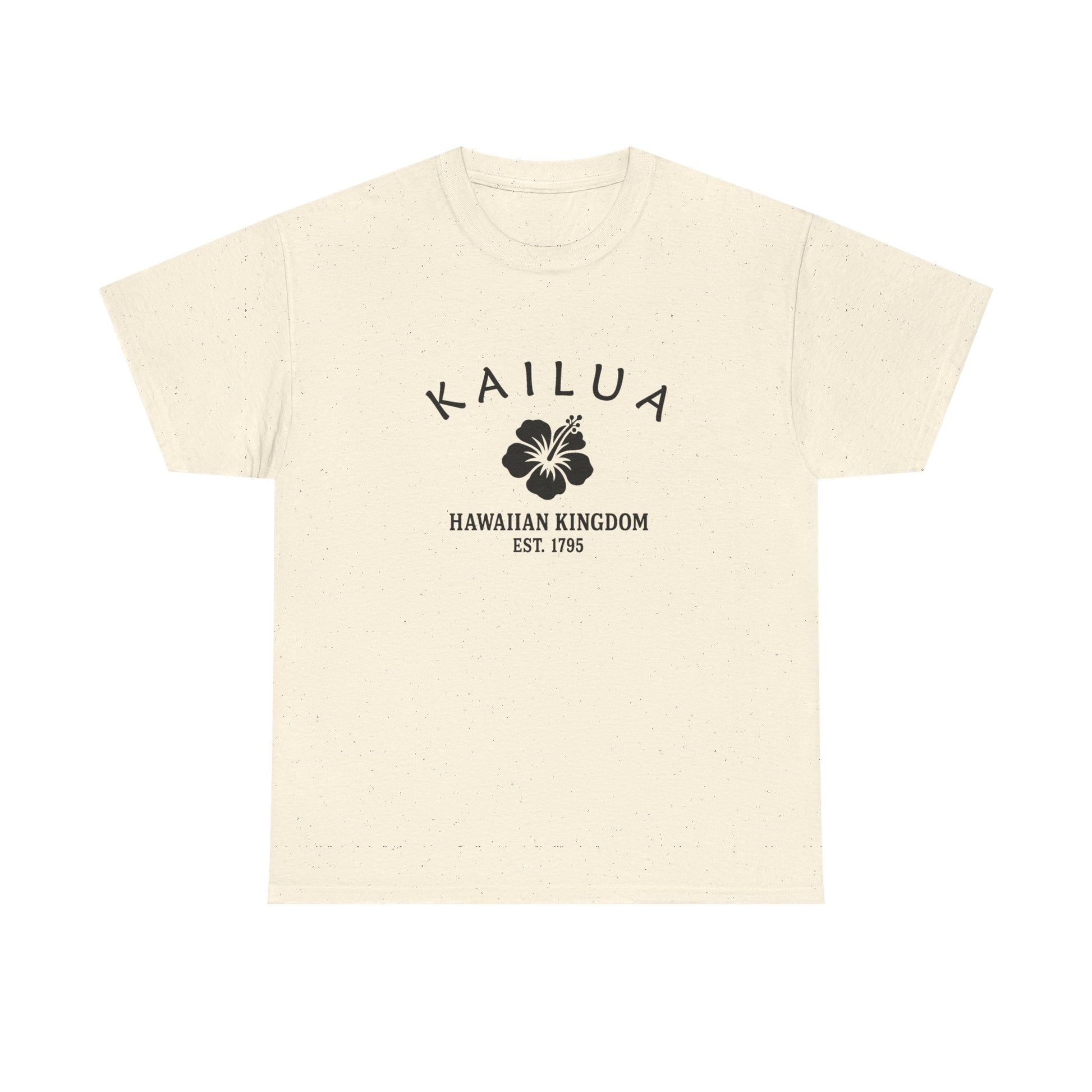
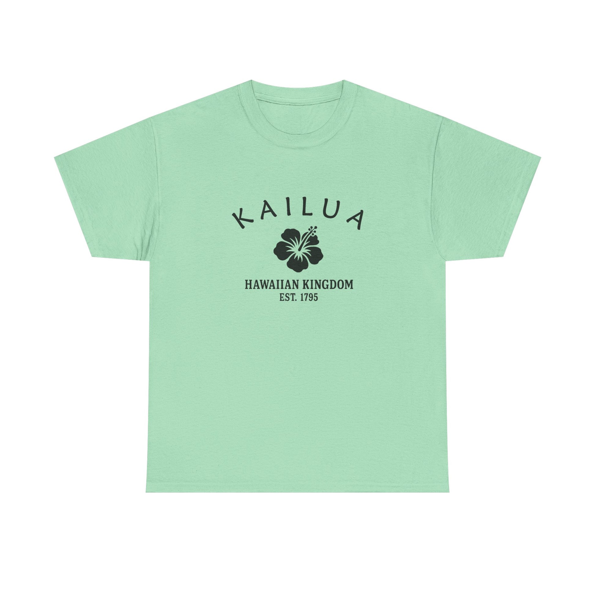
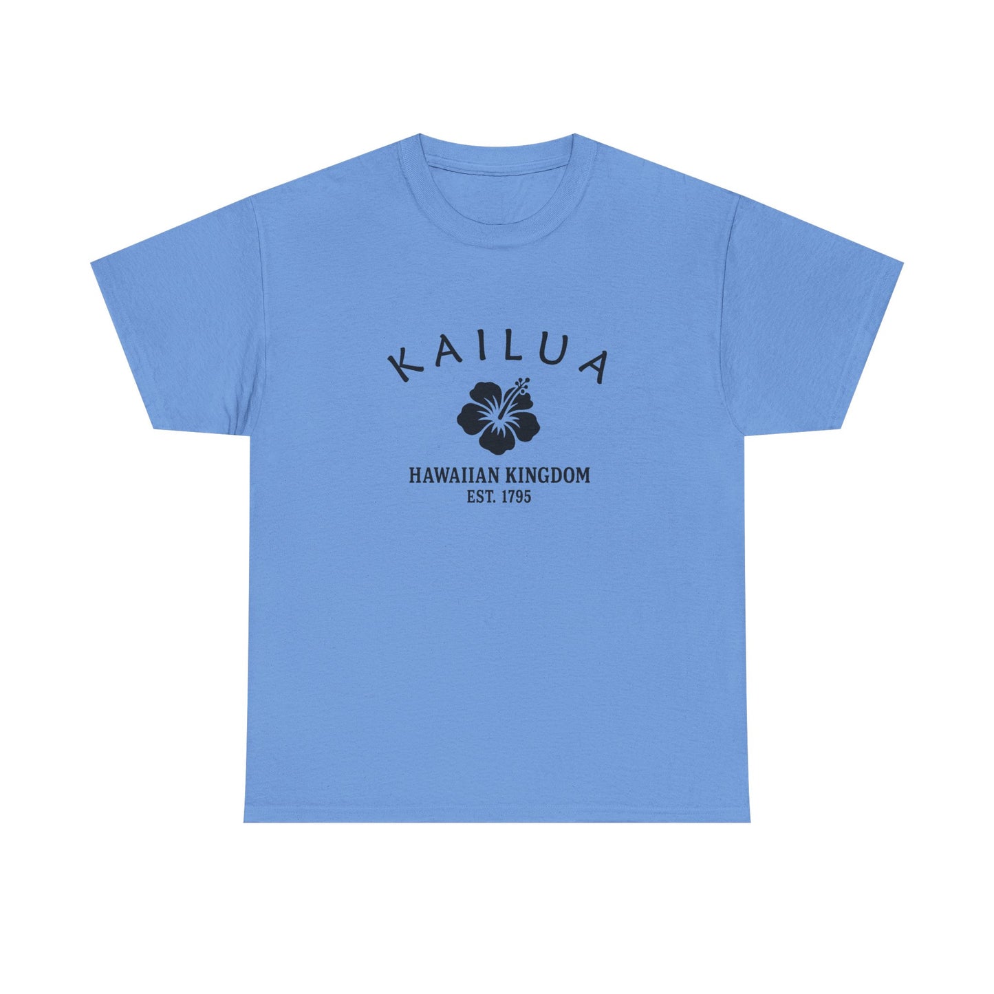
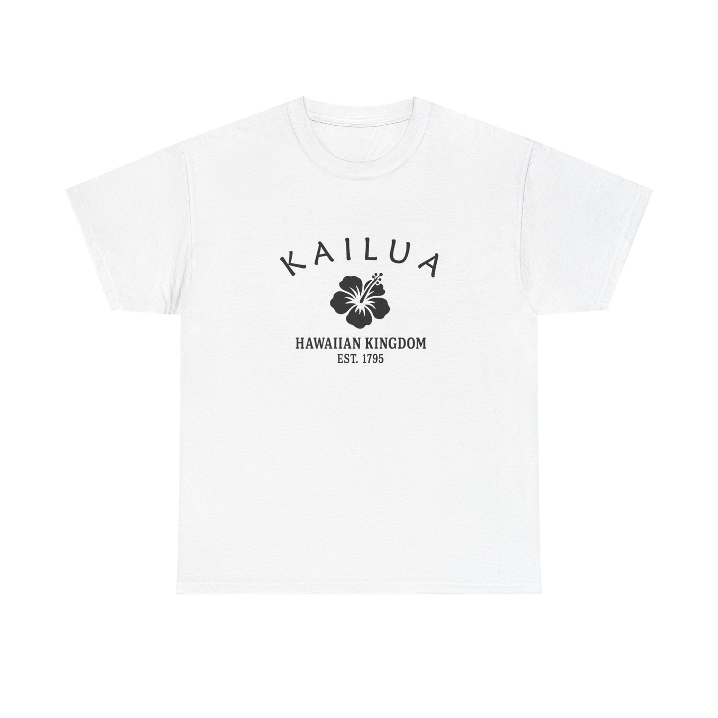
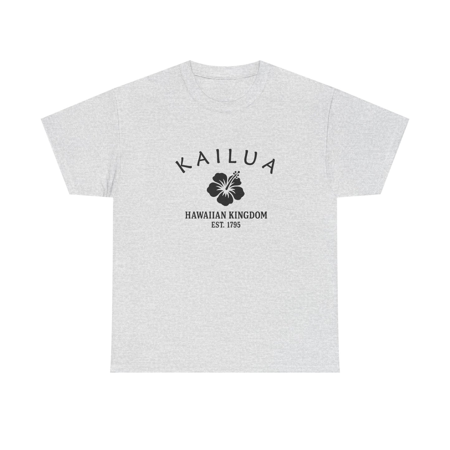
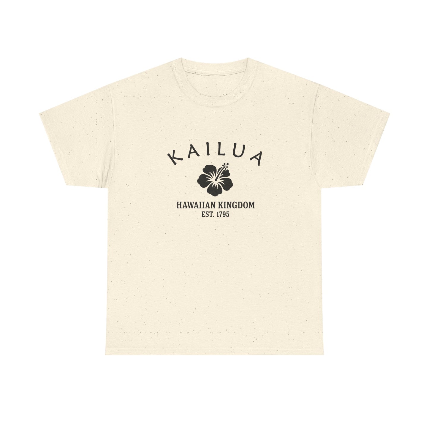
Our Kailua retro logo uses Hawaii’s hibiscus motif, symbolizing beauty, resilience, and aloha. The hibiscus reflects natural abundance and cultural identity, while “1795” connects the design to Hawaiian unification under Kamehameha. Its black-and-white style is simple and vintage, resembling travel decals or crate stamps. The motif bridges Kailua’s dual identity: a traditional community with mid-century suburban growth. On merchandise, it feels authentic and retro, not modern polish. The hibiscus motif reflects Kailua’s story of tradition, resilience, and pride, perfectly suited to a Hawaiian town balancing heritage and progress.
Why People Visit Kailua Hawaii
Kailua blends scenic beaches with Hawaiian heritage. Visitors enjoy swimming, paddling, and short hikes paired with calm town streets. It is picturesque, approachable, and meaningful to many island residents. Travelers find year round appeal in parks, paths, and public spaces. The setting combines natural beauty with accessible neighborhoods and landmarks. History and everyday culture sit side by side in a welcoming way.
![]()